This month's Company magazine has a new look, and is only £1 to promote it. I buy it regularly anyway, and I was really looking forward to the new look.
To be honest, it seems like the main difference is that they've used matte paper rather than glossy throughout. I prefer this finish to be honest - my mum says that it's cheaper than glossy, so both me and the magazine are happy!

I'm a big fan of the fonts they've used a lot - 'SHOES' and 'alexa' being an example of each of the two. They seem either to be new, or used much more now than in the past. Alexa's look on the front cover actually seems really achievable, unlike most of the glossy covers, so I might have a go at that... I guess the key thing is that, to me, this cover looks friendly. Plus I like her lace sleeves.

(highlighting my own)
The 'high street' is a big part of why I like this magazine, so it was good to see that that's not going to change. Lots of the glossies (marie claire is especially guilty of this) fill their fashion section with the kind of brands most of us can only dream about. But Company knows I haven't got bottomless pockets.

The first of the Olympic beauty adverts! After reading this article I have got fairly sensitive to how silly they all are and how few Paralympians are featured. One thing that I wasn't a fan of about this advert - though it's minor and I'm being a pedant - is that Keri-Anne Payne is a swimmer. So she needs waterproof mascara. There is a waterproof mascara in the range - so have that one uncapped! Surely if you can convince the consumer it withstands kilometres of open water then you will convince them that it will survive crying at Love Actually... no?
(I know this isn't actually a gripe that Company could do anything about, just a gripe at Max Factor, but still... attention to detail, guys!)


I might be alone in this, but when a magazine rebrands or anything like that I'm always worried that my favourite regular features will be cut. Never fear! Bargain to blowout, showing progressively more expensive ways to achieve the same look, is still here, as are columnists Jameela and David Whitehouse and the rest of the gang. One thing I like is that we see more of the individual members of the team - we get comments from Oonagh, the Fashion Director, all the way through the magazine.

Just thought I'd show you my favourite pull quote from the issue - it's from Alexa Chung's interview, which was really good :). I thought it was slightly ironic that Company was Alexa's first 'glossy cover' and they're no longer glossy... just me, then.
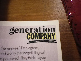
The generation Company articles are something I've always liked about this magazine - instead of just wanting to be walking mannequins they know that their readers want to make something of themselves. This issue has three case studies of women who've made it to the top of their careers (including the PR boss for Benefit - jealous much?) and who can wear jeans to work. A little bit of an odd angle, but hey, it's always fun to read these stories and dream.
Another of the articles in this section was addressing the issue that women often undervalue themselves and don't negotiate for salaries - ending up with lower salaries than other people (often men, who statistically are more likely to have the gall to negotiate) doing the same job.
There was also a feature on a girl using prostitution to get herself nice shoes and so on - a bit same old, same old now, but still interesting.
One thing I liked about this page of the beauty edit was that it's proposing an alternative to bronzer and fake tan - this is definitely a look I'll be copying! It seemed slightly out of sync, though, with the rest of the magazine in that all of the six blushers featured are luxury brands - with the cheapest being the Clarins at £19 and the most expensive the Chanel at £46. I know they have the page where a musician's style is attempted using Rimmel products, but... could they not have found a Maybelline/Collection 2000/etc blusher to feature on the page?
Totally unobtainably high-maintenance, though... and would probably look very weird on.
This was the inside back cover advert, and while I will confess with freedom that I'm not a fan of the shatter nails trend, I understand this trend even less. For a start, it looks almost identical to the shatter nails - if you already own the shatter polish, I see next to no point in purchasing a 'croc effect' polish.
Just...no.
Overall, a great issue, and it's great to see that my worries that the magazine would go downhill with its new look were completely unfounded.


No comments:
Post a Comment